Black and White Pre Wedding Photos: 5 Tips for Indore Couples
Black and white pre wedding photos work best when the picture has a reason to lose its colour. A clear expression, a line of light across a face or the shape of two people against a quiet background can carry a frame without a bright outfit or dramatic setting. For couples planning a pre-wedding shoot in Indore, the useful question is not whether every image should be monochrome. It is which moments become clearer that way.
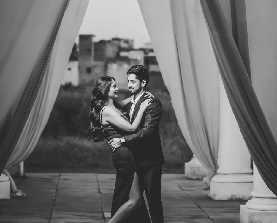
This guide covers five decisions to discuss before the shoot and during photo selection. The featured photograph, supplied from the Shadowgraphy Studio library and presented here in grayscale, illustrates tonal separation and a couple framed by fabric. It is not a recommendation or identification of a shoot location.
1. Choose black and white pre wedding photos for a reason
Start with what you want the viewer to notice. A close expression might benefit from fewer colour distractions. A wider portrait might depend on the outline of your clothes against the background. A photograph whose main appeal is the exact shade of your outfit may belong in the colour selection instead.
Do not treat monochrome as an automatic rescue for a weak picture. Missed focus, an awkward hand or an uncomfortable expression still deserves attention. Compare the colour and black-and-white versions at a useful viewing size, then choose the one that tells the moment more clearly. Keep both only when each version has a real use.
2. Check light and dark tones, not matching colours
Two different colours can become similar shades of grey. This matters when a dark sleeve overlaps a dark outfit or when both people stand against a wall of a similar brightness. Ask the photographer to check separation in a test frame before committing to a long series.
A small change of angle, a simpler background or a different position relative to the light may help. There is no need to buy matching black-and-white clothing. Texture, fit and comfort remain useful starting points. If you are choosing everyday clothes, the casual pre-wedding shoot guide covers a relaxed approach without turning the session into a costume change.
For the edit, ask to retain detail in dark fabric and bright clothing. Strong contrast can suit a photograph, but it should be a deliberate choice rather than a reason that faces or garment edges disappear.
3. Keep expressions and body language comfortable
Removing colour does not require serious expressions in every frame. A laugh, a quiet look and a neutral portrait can all belong in the same set. Choose the mood you actually like rather than copying a reference that feels unlike you.
Begin with a stable stance and contact both people find comfortable. Let the photographer refine a hand or shoulder position instead of holding a strained pose. Our standing pre-wedding pose guide explains simple starting positions; this monochrome guide is about how those pictures read after colour is removed.
Include some space around the couple as well as closer portraits. The close-up portrait guide helps with the tighter part of that set. A gallery with several distances gives you choices without requiring a new pose for every photograph.
4. Agree on the monochrome finish before final delivery
Black-and-white editing can be soft, crisp, grainy or strongly contrasted. Take a few reference images to the planning conversation and explain what you like about them. Is it gentle skin detail, dark backgrounds, bright fabric or the feeling of an older print? Those descriptions are more useful than asking for a vague vintage effect.
Ask whether a sample edit is available within the agreed workflow and how revisions are handled. Confirm which selected pictures receive monochrome versions, whether colour counterparts are included and how those files are named. Do not assume every delivered photo comes in two treatments. Settle the scope with your photographer rather than discovering it during download.
5. Select for the album, not only the phone screen
Review the final shortlist as a sequence. One monochrome portrait can give a colour-led spread a pause; a small monochrome series can tell a complete quiet moment. Neither approach needs a fixed percentage. Avoid repeating almost identical expressions just because the treatments differ.
Before approving a large print, discuss a proof and check the intended crop. A face that looks clear on a bright phone screen may read differently on paper. Keep heads and hands away from an album fold. The background planning guide can also help you choose frames with clean edges and space for a layout.
Plan a small, purposeful monochrome set
For your Indore pre-wedding brief, note the mood, a few tonal references and the intended use of the pictures. Then let the actual light and expressions guide the final selection. To discuss photography for your shoot, call 7385222228.